What Makes a Product Page Convert: From Visitor to Buyer
A great product page isn’t about showing your product—it’s about selling it. Yet most ecommerce brands treat their product pages like an online brochure: pretty photos, a few lines of copy, and a checkout button. That’s not enough. Not when attention is limited and competition is everywhere.
Your product page is one of the most important pieces of real estate in your entire business. It’s where hesitation either disappears—or multiplies. And if it’s not built to convert, you’re leaving serious money on the table.
Here’s how to transform your product page from a scroll-past to a sale.
Start with a headline that makes a promise
The first few lines of your product description—or the heading near your product name—should clearly answer: What is this, and why should I want it now? It’s not enough to list the product name. That tells people what it is. But what does it do? Who’s it for? Why does it matter?
Instead of saying:
“Calm Sleep Gummies”
Try:
“Fall asleep faster, stay asleep longer—without next-day grogginess”
When the first thing people read is a benefit they care about, they keep scrolling.
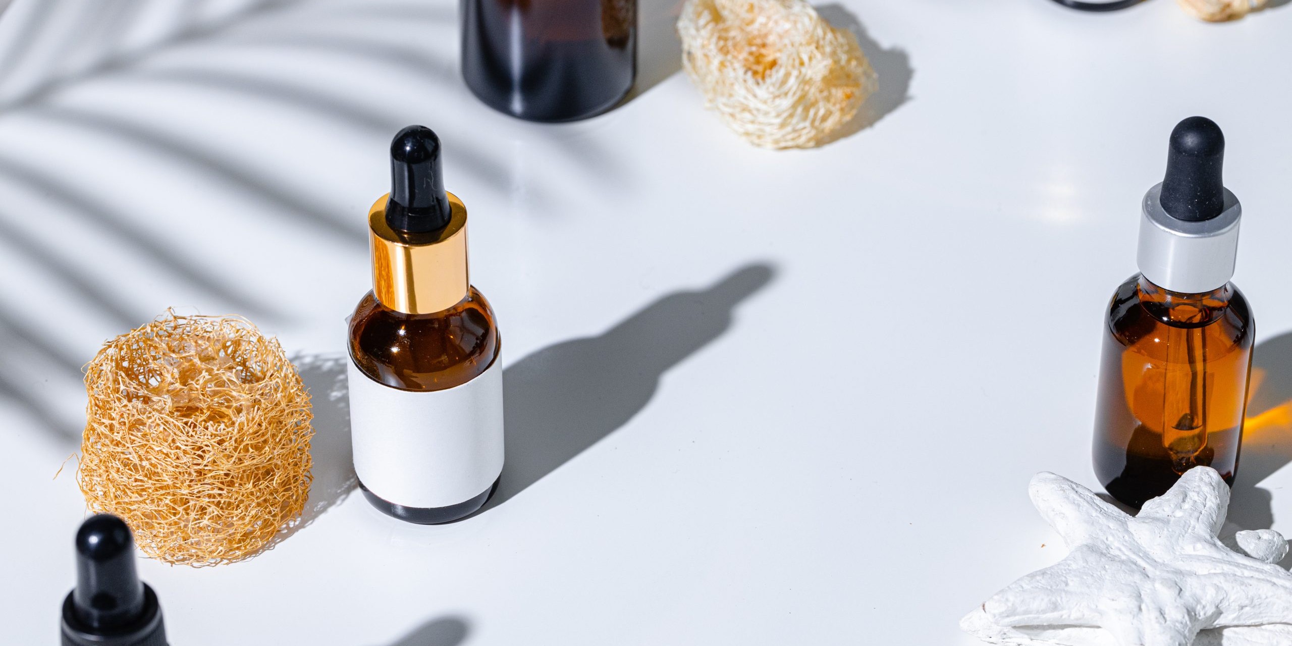
Make your visuals work harder
Yes, product images should be clean and high quality. But they should also tell a story. Show the product from multiple angles. Use lifestyle images so people can imagine themselves using it. Include video, especially vertical video, to showcase texture, movement, or use.
Product in isolation? Good.
Product in someone’s hand? Better.
Product being used in a real moment? Best.
Also: always, always use zoomable images and mobile-friendly galleries. Small details matter.
Turn features into benefits—and make them scannable
A block of text that lists ingredients, specs, or features isn’t persuasive. You need to translate those features into human language. Tell people what those features do for them. Use short bullets, but expand with context when needed.
Instead of:
- 200mg of magnesium
- Vegan formula
- Includes l-theanine
Say:
- 200mg of magnesium to help your body unwind naturally
- 100% vegan formula, zero animal byproducts or fillers
- L-theanine to support focus without jitters
Help your customer imagine the result, not just the ingredient.
Social proof needs to feel real—not staged
Reviews aren’t optional anymore. They’re expected. But they can’t feel like fluff. You want authentic, specific, and recent testimonials. Include photos or videos from real customers if you can. Don’t hide negative reviews—address them honestly and transparently.
And if you’re early-stage and don’t have a ton of reviews yet? Start gathering UGC through post-purchase follow-ups and email prompts. Even one great quote can go a long way.
Also: place your best reviews above the fold, not buried at the bottom.
Build urgency—but make it honest
Urgency works—but fake urgency backfires. Use real constraints when they exist: limited drops, seasonal inventory, or shipping cutoffs.
For example:
“Order by Sunday for delivery before the holiday”
“Only 17 units left—next batch ships in 2 weeks”
These aren’t gimmicks. They’re incentives to act now.
Your CTA button should do one thing: sell the click
This is not the place for creativity. Stick to CTA buttons that are clear, action-oriented, and easy to find.
Good:
- Add to Cart
- Get Yours
- Try It Now
Test placement and color, but don’t bury your button or make people scroll forever to find it.
If your product page isn’t converting, it’s not because people don’t want what you’re selling—it’s because the page isn’t making it clear, urgent, and trustworthy enough to act. Fix that, and everything from your ads to your email flows will start working better.