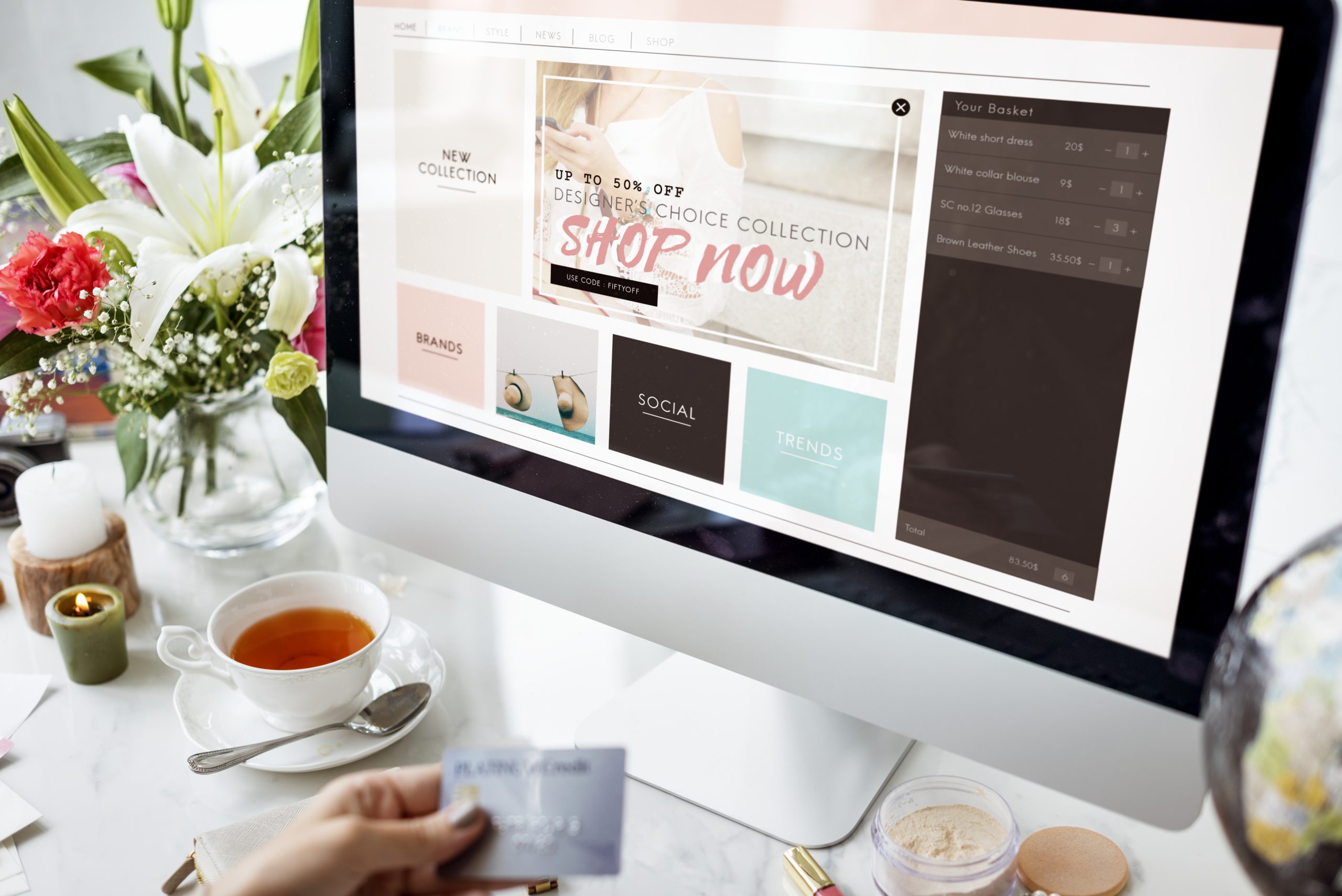
What Makes a Product Page Convert: From Visitor to Buyer
What Makes a Product Page Convert: From Visitor to Buyer
A great product page isn’t about showing your product—it’s about selling it. Yet most ecommerce brands treat their product pages like an online brochure: pretty photos, a few lines of copy, and a checkout button. That’s not enough. Not when attention is limited and competition is everywhere.
Your product page is one of the most important pieces of real estate in your entire business. It’s where hesitation either disappears—or multiplies. And if it’s not built to convert, you’re leaving serious money on the table.
Here’s how to transform your product page from a scroll-past to a sale.
Start with a headline that makes a promise
The first few lines of your product description—or the heading near your product name—should clearly answer: What is this, and why should I want it now? It’s not enough to list the product name. That tells people what it is. But what does it do? Who’s it for? Why does it matter?
Instead of saying:
“Calm Sleep Gummies”
Try:
“Fall asleep faster, stay asleep longer—without next-day grogginess”
When the first thing people read is a benefit they care about, they keep scrolling.
Make your visuals work harder
Yes, product images should be clean and high quality. But they should also tell a story. Show the product from multiple angles. Use lifestyle images so people can imagine themselves using it. Include video, especially vertical video, to showcase texture, movement, or use.
Product in isolation? Good.
Product in someone’s hand? Better.
Product being used in a real moment? Best.
Also: always, always use zoomable images and mobile-friendly galleries. Small details matter.
Turn features into benefits—and make them scannable
A block of text that lists ingredients, specs, or features isn’t persuasive. You need to translate those features into human language. Tell people what those features do for them. Use short bullets, but expand with context when needed.
Instead of:
- 200mg of magnesium
- Vegan formula
- Includes l-theanine
Say:
- 200mg of magnesium to help your body unwind naturally
- 100% vegan formula, zero animal byproducts or fillers
- L-theanine to support focus without jitters
Help your customer imagine the result, not just the ingredient.
Social proof needs to feel real—not staged
Reviews aren’t optional anymore. They’re expected. But they can’t feel like fluff. You want authentic, specific, and recent testimonials. Include photos or videos from real customers if you can. Don’t hide negative reviews—address them honestly and transparently.
And if you’re early-stage and don’t have a ton of reviews yet? Start gathering UGC through post-purchase follow-ups and email prompts. Even one great quote can go a long way.
Also: place your best reviews above the fold, not buried at the bottom.
Build urgency—but make it honest
Urgency works—but fake urgency backfires. Use real constraints when they exist: limited drops, seasonal inventory, or shipping cutoffs.
For example:
“Order by Sunday for delivery before the holiday”
“Only 17 units left—next batch ships in 2 weeks”
These aren’t gimmicks. They’re incentives to act now.
Your CTA button should do one thing: sell the click
This is not the place for creativity. Stick to CTA buttons that are clear, action-oriented, and easy to find.
Good:
- Add to Cart
- Get Yours
- Try It Now
Test placement and color, but don’t bury your button or make people scroll forever to find it.
If your product page isn't converting, it's not because people don’t want what you’re selling—it’s because the page isn’t making it clear, urgent, and trustworthy enough to act. Fix that, and everything from your ads to your email flows will start working better.
How to Write Marketing Emails That Actually Get Opened
How to Write Marketing Emails That Actually Get Opened
For all the talk about TikTok, AI, and creator-led brands, email is still the undefeated champion of direct response marketing. It’s not dead. It’s just been badly abused by brands sending robotic, template-heavy blasts with subject lines that sound like digital wallpaper.
If your open rates are tanking, your emails aren’t getting ignored because people don’t check their inbox—they’re getting ignored because you gave them a reason to skip it. Your job isn’t to create the prettiest email. Your job is to create an email that someone actually wants to open—and maybe even looks forward to.
This isn’t about gimmicks. It’s about respecting attention. Here’s how to write marketing emails that cut through the noise, drive action, and build customer loyalty one subject line at a time.
Why open rates are your first conversion
Think of the subject line as your headline. The email as your pitch. And the click-through as your conversion. If the subject doesn’t spark curiosity or feel relevant, nothing inside the email matters. You’ve already lost.
Most brands focus way too much on the design of the email and not enough on what actually gets it opened. Buttons don’t matter if no one sees them. Carousels don’t matter if your copy is flat. Design supports performance—but it doesn’t create it. The words do.
So if you’re not seeing results from your email campaigns, don’t start by redesigning the template. Start by rewriting the subject line.
The subject line formula that actually works
There’s no magic subject line. But there are patterns that perform again and again because they tap into how people behave—not how brands think.
Here are 5 types of subject lines that consistently drive higher open rates:
- Curiosity-based:
“This changed how I shop forever…” - Benefit-focused:
“Get better sleep in 2 nights—without pills” - Question format:
“Struggling with dry skin this fall?” - Scarcity or urgency:
“Only 3 hours left: 20% off everything” - Personalized:
“Sofia, your refill is almost out”
These subject lines work not because they trick people—but because they speak to real problems, real desires, and real timing. When in doubt, test versions of each type. Your audience will tell you what they respond to.
Why your preheader text matters more than you think
The subject line gets the attention. The preheader seals the deal. That little preview text under the subject line in most inboxes is your second hook—and most brands waste it with “View this email in your browser” or nothing at all.
Use that space to reinforce your offer, create urgency, or deliver context.
Examples:
- Subject: “Something for your Sunday night routine”
Preheader: “Hint: it involves 10 minutes, a warm drink, and zero screens” - Subject: “You're not too late (yet)”
Preheader: “But our last batch of orders ships tonight”
Treat the preheader like the subtitle of a Netflix show. It should pull people in even deeper.
The body of the email: write like a person, not a brand
This is where most emails collapse. The subject line works, the preheader is fine—and then the email opens like a stiff press release or a lazy product dump. Your email copy should read like a helpful note from someone who gets your customer, not like a company brochure.
Good marketing emails are short, skimmable, and anchored in one clear purpose. Don't overload them with five CTAs or jam three campaigns into one message. One email, one goal.
Talk to one person. Use phrases like “you,” “here’s what we thought you’d like,” and “next step.” Drop the brand-speak. People don’t engage with brands—they engage with people. The more natural your copy sounds, the more it gets read.
What to send besides promos
If the only emails you send are discounts and restocks, your audience will learn to ignore you—until they want a deal. That’s not a relationship. That’s a transaction.
Mix in value-driven content that educates, entertains, or empowers. Depending on your brand, this could be:
- A story from a founder or team member
- Tips related to your product’s use (without sounding like a manual)
- Short video links (especially 9:16 verticals)
- Social proof or testimonials
- Behind-the-scenes product insights
- Community shoutouts or UGC highlights
Email isn’t just for pushing product. It’s for building connection. And connection = retention.
Timing and consistency beat overthinking
Brands that overthink email usually underperform. They wait too long, send too little, and second-guess everything. Consistency wins in email. Your list wants to hear from you—remind them that you're here to help, to serve, and to solve something that matters.
You don’t need to send every day. But you do need a cadence they can rely on. Weekly campaigns. Monthly product roundups. Automated flows triggered by behavior. It’s not about blasting. It’s about rhythm.
If you’re not sure where to start, send one value email per week—no pitch, just helpful insight. Build trust. Then earn the right to make an ask.
The TL;DR? Write like a real human who wants to be useful. That’s the kind of email that gets opened. And that’s the kind of email that makes money.

Conversion-Driven Design: How to Stop Making Pretty Things That Don’t Sell
Conversion-Driven Design: How to Stop Making Pretty Things That Don’t Sell
Design can make your brand feel polished, premium, and trustworthy. But if it doesn’t drive action, it’s not doing its job. The truth is, most early-stage brands over-prioritize aesthetics and under-prioritize performance. They end up with gorgeous websites, clever animations, and branded layouts that don’t actually convert visitors into customers.
This happens all the time—especially in DTC, wellness, and consumer brands. Founders fall in love with the look, not the function. Designers optimize for visual harmony, not user flow. And marketers are left wondering why conversion rates flatline.
Design isn’t just how something looks. It’s how it works. And if it’s not guiding people toward a clear action, it’s just expensive decoration.
Let’s break down how to shift from “pretty” to “profitable.”
Design should clarify, not confuse
Good design eliminates friction. It makes the next step feel obvious and inevitable. When your site or landing page is overloaded with fancy layout tricks, vague headlines, or scattered navigation, users don’t lean in—they leave.
Ask yourself: Can someone tell…
- What I’m selling?
- Who it’s for?
- Why it’s different?
- What they should do next?
If those aren’t answered visually and verbally within the first few scrolls, it doesn’t matter how slick the site is. You're leaking revenue.
The fix? Build for clarity before cleverness. Your homepage isn’t a canvas. It’s a funnel.
Visual hierarchy is the silent hero of every high-converting page
You don’t need to shout to be heard—but you do need to guide the eye. Visual hierarchy is what helps people process information in the right order. It’s what turns a busy page into a clear, persuasive message.
Every section of your page should follow a rhythm:
- Bold, direct headline (the “why care?”)
- Short subtext (the “how does this help?”)
- Visual that reinforces the message (product in action, not just product)
- Clear CTA (button with specific intent)
Good hierarchy builds momentum. It makes people want to keep scrolling because it feels effortless.
Bad hierarchy makes them guess what’s important. That kills trust.
Aesthetic doesn’t equal premium—confidence does
Minimalist design isn’t inherently better. In fact, it often hides weak messaging. Brands that lean too hard on white space and moody fonts often forget that their job is to communicate, not just “look elevated.”
True premium brands are clear, confident, and unafraid to speak directly. That means using bold headlines, real customer proof, and clear actions—even in a clean aesthetic.
What feels premium is not silence. It’s conviction. Premium doesn’t whisper. It communicates value without friction.
Design for speed, not just style
You have less than 3 seconds to make someone stay. If your site is loading slowly because of oversized images, custom fonts, or unnecessary motion, you’re paying the price in bounce rate.
Speed is design. Every animation, scroll effect, or embedded video needs to earn its place. Run your site through PageSpeed Insights and strip anything slowing you down.
If your homepage looks amazing on desktop but crashes on mobile, you’ve already lost the game.
How to audit your current design for conversion (simple checklist)
Here’s a 5-minute test you can run right now on your own site or landing page:
Above the fold test:
In the first 5 seconds, can a cold visitor tell what you do and who it’s for?
CTA visibility:
Is there a bold, contrasting CTA button visible within the first viewport?
Visual support:
Do your images and videos show the product in action—or are they just aesthetic?
Proof:
Do you have real testimonials, reviews, or social validation before asking for a purchase?
Clarity check:
Read your copy out loud. Does it sound like something a person would say, or something a designer wrote to sound clever?
If you fail more than two of these, your design isn’t working as hard as it should.
What conversion-first design actually looks like (examples)
Let’s say you sell an adaptogenic tea brand. Here's how your homepage could look depending on your design mindset:
Design-first mindset:
- Hero image of leaves blowing in the wind
- Tagline: “Brew Balance”
- CTA buried in the nav
- Product buried two scrolls down
- No reviews or explanation of ingredients
Conversion-first mindset:
- Hero image: person drinking tea with headline: “Reduce stress in 5 minutes. No pills.”
- Clear CTA: “Try the Starter Kit”
- Subheadline: “Backed by clinical herbs and 1,500+ 5-star reviews”
- Product benefits + UGC video immediately visible
Same brand. Same product. One sells. The other just vibes. When you start designing for conversion, your metrics change. Time on site goes up. Bounce rate drops. Clicks rise. And most importantly—sales happen. You don’t have to choose between beautiful design and performance. But if you want results, beauty should serve the goal—not distract from it.

How to Build a Memorable Brand With Google Ads
How to Build a Memorable Brand With Google Ads
Google Ads are usually seen as a tool for capturing demand, not creating it. Most brands use them to show up when someone’s already looking—“skincare for dry skin,” “best running shoes,” “fast protein snacks.” That’s powerful. But there’s more to it.
Used strategically, Google Ads can also build brand memory, shape how you’re perceived, and position your offer before your customer ever lands on your site. The search results page is the new storefront. And when your brand shows up there with clarity, consistency, and authority, you’re not just winning clicks—you’re winning mindshare.
Let’s look at how to use Google Ads to not just drive sales, but grow a brand people remember.
Start with your branded search terms
Branded search terms—like “[your brand name] skincare” or “[your brand name] reviews”—may seem redundant to bid on. After all, if someone’s searching your brand, won’t they find you anyway?
Not always. Competitors can bid on your name. Review sites can outrank your homepage. And if you don’t show up first, someone else controls the narrative.
Bidding on your branded terms is like owning your front door. You ensure that the first impression people get—whether they heard about you on TikTok or through word of mouth—is one you control. Your copy, your message, your voice.
And when that ad copy reinforces what makes your brand different, it becomes more than a navigation tool—it becomes a reinforcement loop.
Go beyond direct response: build intent over time
Most marketers only target high-intent keywords. That makes sense if you’re looking for conversions now. But if you want long-term brand growth, you need to show up before your customer is ready to buy.
Let’s say you sell a clean energy drink. Don’t just bid on “buy clean energy drink.” Build campaigns around:
-
“Why am I always tired in the afternoon?”
-
“Is caffeine bad for anxiety?”
-
“Healthy alternatives to Red Bull”
-
“How to boost energy without sugar”
These keywords are where intent begins. When your brand is present at this stage, you earn trust before your competitors even enter the picture.
You’re not just selling a product—you’re helping solve a problem. That’s brand equity in motion.
Use your copy to deliver brand feeling, not just info
Most Google Ads read like plain labels. “Fast shipping. Quality guaranteed. Buy now.” That’s fine—but forgettable.
Your copy should echo the voice of your brand, even in 90 characters. Use your headline and description to communicate something emotional, personal, or bold.
Instead of:
“Clean skincare. Free shipping. Order now.”
Try:
“Finally—skincare that respects your skin (and your standards).”
“Thousands of people made the switch. Here’s why.”
This is your brand’s chance to speak in its own tone—even in a crowded auction.
Pair your search ads with smart landing pages
A strong Google Ad only works if the destination matches the expectation. If your ad copy promises relief from bloating, but your landing page leads with ingredients and product features, you’re creating dissonance.
Make sure your search ads are paired with intent-specific landing pages that speak directly to the searcher’s question, emotion, or motivation.
Someone searching “best vegan protein powder” isn’t just looking for a product—they’re looking for reasons to believe. Show social proof. Answer objections. Prove the difference. Do it fast, above the fold.
Great Google Ads feel like a natural step toward something useful—not a detour into generic marketing. It doesn't have to feel cold or transactional. With the right strategy, they can be one of your most powerful brand-building tools. Show up early. Speak with clarity. Reinforce what makes you different. Do that enough times, and your audience won’t just click—they’ll remember you.

How to Launch a Product Without Spending on Ads
How to Launch a Product Without Spending on Ads
We get it—ads are expensive. CPMs are up. Attribution’s a mess. And not every launch can afford to drop thousands on Meta or TikTok just to test a product.
But here’s the thing: the best product launches aren’t built on ads. They’re built on attention, energy, and trust. And if you have those three, you don’t need a six-figure media budget—you just need a plan that’s smart, scrappy, and built to move people.
This is how to launch a product with $0 in paid spend—and still make it feel big.
Warm the list (before you ask for anything)
Too many brands wait until launch day to start posting. That’s a mistake. If you want people to care when you drop something, you need to start building energy at least 2–3 weeks out.
Here’s what that can look like:
- Post “we’re cooking something” teasers
- Run polls or Qs about pain points the product solves
- Share behind-the-scenes photos, packaging samples, product fails
- Let your list guess what it might be
- Show raw moments: production, first samples, test feedback
This pre-launch phase isn’t hype—it’s alignment. You’re pulling your audience into the journey, so when you do drop, they’re already invested.
Use content as your campaign engine
Organic content is your best traffic driver when you don’t have ad dollars. But you can’t just post once and hope it lands. You need a content launch sprint—a focused burst of content over 5–10 days that hits multiple angles.
Here’s a simple framework:
- Problem → solution post (what it solves, how)
- Founder POV video (why you made it, who it’s for)
- UGC-style demo (how to use it / what makes it different)
- Countdown or “it’s almost here” posts
- FAQ carousel
- Customer reactions if you have any testers
Batch it. Schedule it. And don’t be afraid to repeat the message in different formats (reel, story, static, email).
Consistency is more important than creativity here.
Activate your inner circle
Every brand has a circle—past customers, early believers, friends of the founder, ambassadors, creators who’ve used your product before. For a scrappy launch, this group is gold.
Reach out personally. Not with a copy-paste blast, but a real DM or email:
“Hey, we’re launching something I think you’ll love. No pressure, but if you’re down to share it when it goes live, it’d mean a ton.”
Offer early access. Create a shareable asset (like a product trailer or story post). Make it easy for them to support you.
People want to support brands they feel close to—but they need a clear path.
Turn email and SMS into your pressure cooker
Your owned channels are where conversions happen. If you don’t use ads, email and SMS become your revenue engines.
Here’s a lean but effective flow:
- Teaser email 3–5 days before launch: “Something new is coming…”
- Early access email to your most engaged subscribers
- Launch day email: big image, direct CTA, key benefit
- Story time email: 1–2 days later, founder backstory
- “In case you missed it” reminder email after 72 hours
Pair this with 2–3 well-timed SMS messages: one for launch, one for urgency, and one for restock or social proof.
This isn’t spam. It’s storytelling with timing.
Build urgency—without faking it
You don’t need to create false scarcity. Just frame the truth in a way that inspires action.
Real urgency sounds like:
- “We only made 300 units to start.”
- “First drop-ships this Friday only.”
- “Restocks won’t come for 4–6 weeks.”
- “You’re the first to know—next week we open it to everyone.”
Urgency without clarity feels manipulative. Urgency with context builds momentum.
The no-ads mindset: make noise louder than your budget
Here’s what you need to remember: launches aren’t about reach. They’re about attention. And you don’t need millions of impressions to have a successful one—you need hundreds of the right people to care.
And when you do it right—when the content lands, the message hits, the product resonates—your audience does the distribution for you. That’s how no-spend launches turn into high-impact ones.
You don’t need a paid media team. You need a pulse.
Use what you’ve got. Show up. Speak clearly. Bring people into the moment.
Because a great launch isn’t about budget—it’s about belief.

Why Every Ecommerce Brand Needs a Studio Setup (Even a Basic One)
Why Every Ecommerce Brand Needs a Studio Setup (Even a Basic One)
It used to be that building an ecommerce brand meant designing packaging, finding a 3PL, and setting up a Shopify store. Today? That’s just the backend. What actually drives sales—the front end—is content. And content starts with a studio.
Not a massive, 8-light setup with a RED camera crew. Just a small, intentional space where you can consistently film the kind of videos that move product: UGC-style reels, product demos, unboxings, founder messages, and behind-the-scenes moments.
The brands winning right now don’t just “create content”—they produce at scale. They treat video the same way they treat inventory: essential, repeatable, and worth investing in.
Here’s why building your own studio setup—no matter how simple—is one of the smartest moves an ecommerce brand can make in 2025.
Your content is your store. And your store never sleeps.
Most people won’t walk into a retail space to discover your product—they’ll see it on their feed. Which means your videos, photos, and stories are doing the heavy lifting your in-store team used to do.
If your last video was from a photoshoot 8 months ago, and your newest post is a flat lay, you’re not in the game. You’re fading into the background while competitors post 4x/week with high-converting UGC and creator clips.
A studio setup isn’t about going “pro.” It’s about going consistent. It gives you the power to create whenever you want—without waiting on freelancers, agency timelines, or seasonal shoots.
What a simple, effective studio looks like
You don’t need a 1,000 sq ft warehouse to make content that converts. You need:
- Good lighting: A window with indirect sunlight + a $40 ring light is enough to start
- Phone tripod: Hands-free = more freedom = better shots
- Backdrops: Neutral walls, colored paper rolls, or even wood tables give variety
- Mic or lavalier: For any talking head content, crisp audio matters
- Space to move: A 5x5 area is enough for most solo or product content
Add a rolling cart for props, some plants for texture, and boom—you’ve got a set you can reset in 10 minutes.
The key isn’t how big or expensive your setup is. It’s how repeatable it is.
5 types of videos you should be filming in your own space
Here’s what to prioritize once your studio’s up:
- Product demos
Show the texture, motion, and real-life use of your product. Think pouring, mixing, applying, opening—whatever makes it tangible. - UGC-style content
Even if it’s you or your team, film content as if it were from a real customer. Natural light, informal tone, no scripts. “I’ve been using this for 3 weeks…” style hits every time. - Founder/founder team clips
Get on camera. Talk to your customers. Launches, restocks, BTS—it doesn’t need to be polished, just real. - FAQs turned into short-form
Turn your most common support questions into Instagram Reels or TikToks. “What makes this different?” → show them. - Reviews brought to life
Take real customer reviews and voice them over product footage. Or react to them on camera. This builds trust faster than text alone.
This kind of content builds credibility, drives conversions, and feeds all your paid + organic channels.
If you're not producing content, you're playing defense
The truth is, in today’s ecommerce landscape, content isn’t a nice-to-have—it’s a growth lever. And if you’re always waiting on a production partner or creator campaign, you’re operating on a delay.
Owning your own production flow gives you:
- Speed: Launch same-day when trends or sales shift
- Agility: Test new angles, formats, or hooks fast
- Volume: More pieces of content = more chances to win
- Control: You don’t have to explain your product—you live it
You don’t need to go full production studio to compete. You just need a setup that removes friction from creating.
Build the space now—thank yourself every week after
A simple, dedicated studio setup means you never have to ask, “Where do we shoot this?” again. It becomes part of your process. Film every Monday. Shoot batch content once a month. Bring new products in for test videos before launch.
This isn’t about becoming a production house. It’s about treating content like inventory: always stocked, always fresh, always moving.
Because in 2025, the brands that show up on video are the brands that stay top of mind—and top of cart.
