What Makes a Product Page Convert: From Visitor to Buyer
What Makes a Product Page Convert: From Visitor to Buyer
A great product page isn’t about showing your product—it’s about selling it. Yet most ecommerce brands treat their product pages like an online brochure: pretty photos, a few lines of copy, and a checkout button. That’s not enough. Not when attention is limited and competition is everywhere.
Your product page is one of the most important pieces of real estate in your entire business. It’s where hesitation either disappears—or multiplies. And if it’s not built to convert, you’re leaving serious money on the table.
Here’s how to transform your product page from a scroll-past to a sale.
Start with a headline that makes a promise
The first few lines of your product description—or the heading near your product name—should clearly answer: What is this, and why should I want it now? It’s not enough to list the product name. That tells people what it is. But what does it do? Who’s it for? Why does it matter?
Instead of saying:
“Calm Sleep Gummies”
Try:
“Fall asleep faster, stay asleep longer—without next-day grogginess”
When the first thing people read is a benefit they care about, they keep scrolling.
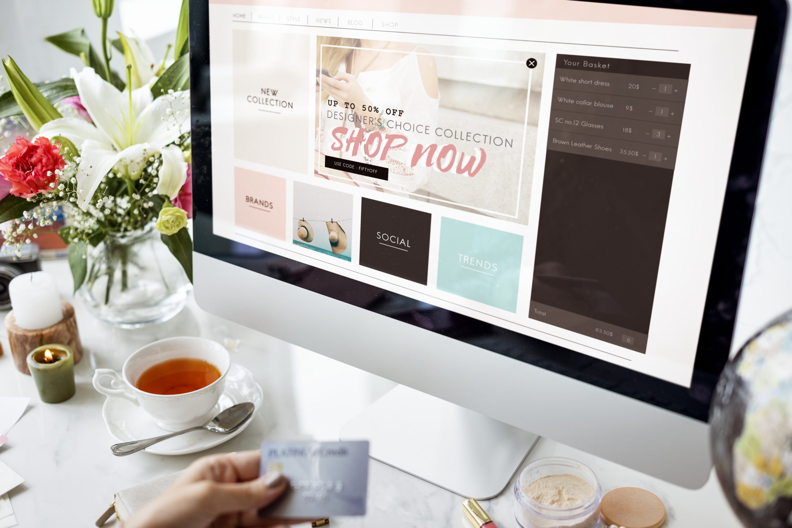
Make your visuals work harder
Yes, product images should be clean and high quality. But they should also tell a story. Show the product from multiple angles. Use lifestyle images so people can imagine themselves using it. Include video, especially vertical video, to showcase texture, movement, or use.
Product in isolation? Good.
Product in someone’s hand? Better.
Product being used in a real moment? Best.
Also: always, always use zoomable images and mobile-friendly galleries. Small details matter.
Turn features into benefits—and make them scannable
A block of text that lists ingredients, specs, or features isn’t persuasive. You need to translate those features into human language. Tell people what those features do for them. Use short bullets, but expand with context when needed.
Instead of:
- 200mg of magnesium
- Vegan formula
- Includes l-theanine
Say:
- 200mg of magnesium to help your body unwind naturally
- 100% vegan formula, zero animal byproducts or fillers
- L-theanine to support focus without jitters
Help your customer imagine the result, not just the ingredient.
Social proof needs to feel real—not staged
Reviews aren’t optional anymore. They’re expected. But they can’t feel like fluff. You want authentic, specific, and recent testimonials. Include photos or videos from real customers if you can. Don’t hide negative reviews—address them honestly and transparently.
And if you’re early-stage and don’t have a ton of reviews yet? Start gathering UGC through post-purchase follow-ups and email prompts. Even one great quote can go a long way.
Also: place your best reviews above the fold, not buried at the bottom.
Build urgency—but make it honest
Urgency works—but fake urgency backfires. Use real constraints when they exist: limited drops, seasonal inventory, or shipping cutoffs.
For example:
“Order by Sunday for delivery before the holiday”
“Only 17 units left—next batch ships in 2 weeks”
These aren’t gimmicks. They’re incentives to act now.
Your CTA button should do one thing: sell the click
This is not the place for creativity. Stick to CTA buttons that are clear, action-oriented, and easy to find.
Good:
- Add to Cart
- Get Yours
- Try It Now
Test placement and color, but don’t bury your button or make people scroll forever to find it.
If your product page isn't converting, it's not because people don’t want what you’re selling—it’s because the page isn’t making it clear, urgent, and trustworthy enough to act. Fix that, and everything from your ads to your email flows will start working better.

Conversion-Driven Design: How to Stop Making Pretty Things That Don’t Sell
Conversion-Driven Design: How to Stop Making Pretty Things That Don’t Sell
Design can make your brand feel polished, premium, and trustworthy. But if it doesn’t drive action, it’s not doing its job. The truth is, most early-stage brands over-prioritize aesthetics and under-prioritize performance. They end up with gorgeous websites, clever animations, and branded layouts that don’t actually convert visitors into customers.
This happens all the time—especially in DTC, wellness, and consumer brands. Founders fall in love with the look, not the function. Designers optimize for visual harmony, not user flow. And marketers are left wondering why conversion rates flatline.
Design isn’t just how something looks. It’s how it works. And if it’s not guiding people toward a clear action, it’s just expensive decoration.
Let’s break down how to shift from “pretty” to “profitable.”
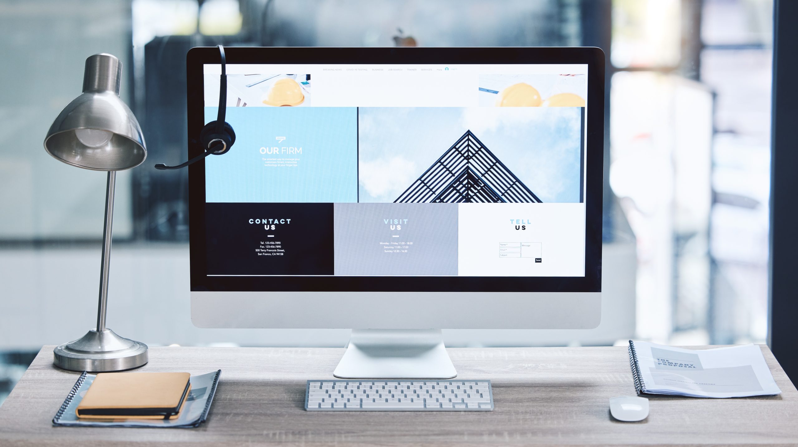
Design should clarify, not confuse
Good design eliminates friction. It makes the next step feel obvious and inevitable. When your site or landing page is overloaded with fancy layout tricks, vague headlines, or scattered navigation, users don’t lean in—they leave.
Ask yourself: Can someone tell…
- What I’m selling?
- Who it’s for?
- Why it’s different?
- What they should do next?
If those aren’t answered visually and verbally within the first few scrolls, it doesn’t matter how slick the site is. You're leaking revenue.
The fix? Build for clarity before cleverness. Your homepage isn’t a canvas. It’s a funnel.
Visual hierarchy is the silent hero of every high-converting page
You don’t need to shout to be heard—but you do need to guide the eye. Visual hierarchy is what helps people process information in the right order. It’s what turns a busy page into a clear, persuasive message.
Every section of your page should follow a rhythm:
- Bold, direct headline (the “why care?”)
- Short subtext (the “how does this help?”)
- Visual that reinforces the message (product in action, not just product)
- Clear CTA (button with specific intent)
Good hierarchy builds momentum. It makes people want to keep scrolling because it feels effortless.
Bad hierarchy makes them guess what’s important. That kills trust.
Aesthetic doesn’t equal premium—confidence does
Minimalist design isn’t inherently better. In fact, it often hides weak messaging. Brands that lean too hard on white space and moody fonts often forget that their job is to communicate, not just “look elevated.”
True premium brands are clear, confident, and unafraid to speak directly. That means using bold headlines, real customer proof, and clear actions—even in a clean aesthetic.
What feels premium is not silence. It’s conviction. Premium doesn’t whisper. It communicates value without friction.
Design for speed, not just style
You have less than 3 seconds to make someone stay. If your site is loading slowly because of oversized images, custom fonts, or unnecessary motion, you’re paying the price in bounce rate.
Speed is design. Every animation, scroll effect, or embedded video needs to earn its place. Run your site through PageSpeed Insights and strip anything slowing you down.
If your homepage looks amazing on desktop but crashes on mobile, you’ve already lost the game.
How to audit your current design for conversion (simple checklist)
Here’s a 5-minute test you can run right now on your own site or landing page:
Above the fold test:
In the first 5 seconds, can a cold visitor tell what you do and who it’s for?
CTA visibility:
Is there a bold, contrasting CTA button visible within the first viewport?
Visual support:
Do your images and videos show the product in action—or are they just aesthetic?
Proof:
Do you have real testimonials, reviews, or social validation before asking for a purchase?
Clarity check:
Read your copy out loud. Does it sound like something a person would say, or something a designer wrote to sound clever?
If you fail more than two of these, your design isn’t working as hard as it should.
What conversion-first design actually looks like (examples)
Let’s say you sell an adaptogenic tea brand. Here's how your homepage could look depending on your design mindset:
Design-first mindset:
- Hero image of leaves blowing in the wind
- Tagline: “Brew Balance”
- CTA buried in the nav
- Product buried two scrolls down
- No reviews or explanation of ingredients
Conversion-first mindset:
- Hero image: person drinking tea with headline: “Reduce stress in 5 minutes. No pills.”
- Clear CTA: “Try the Starter Kit”
- Subheadline: “Backed by clinical herbs and 1,500+ 5-star reviews”
- Product benefits + UGC video immediately visible
Same brand. Same product. One sells. The other just vibes. When you start designing for conversion, your metrics change. Time on site goes up. Bounce rate drops. Clicks rise. And most importantly—sales happen. You don’t have to choose between beautiful design and performance. But if you want results, beauty should serve the goal—not distract from it.
Is Your Website Just Pretty—or Does It Actually Convert?
Is Your Website Just Pretty—or Does It Actually Convert?
A beautiful website that doesn’t convert is like a Lamborghini with no engine. Sure, it looks great in screenshots. But it’s not going anywhere.
Founders and marketers spend weeks (sometimes months) obsessing over typography, animations, color palettes, and “vibe”—and then forget that the primary purpose of a brand site is to move people toward action. Whether it’s buying a product, booking a service, or signing up for more info, your website isn’t just a brand asset. It’s a sales platform.
If your traffic looks good, but your revenue doesn’t reflect it, your site isn’t converting. And odds are, design isn’t the issue—it’s clarity, structure, and messaging.
Let’s walk through how to tell if your website is just pretty… or actually doing its job.
What Makes a Website Convert in 2025
Conversion today isn’t about flashing banners or aggressive CTAs. It’s about user trust, clarity, and intuitive experience. Visitors decide within seconds whether they’re in the right place—and whether they believe your offer is for them.
If your homepage doesn’t immediately communicate who you help, how you help them, and what they should do next, you’re already leaking revenue.
Here’s what high-converting sites consistently get right.
Clear, Outcome-Driven Messaging
Your headline should answer the question: Why should I care, and what’s in it for me? This is not the place for abstract taglines or clever phrases. Save the poetry for your manifesto.
Great homepage headers look like:
- “Clean skincare made for sensitive skin—no fluff, no fragrance”
- “Better sleep in 14 days, backed by real data”
- “From concept to launch: Launch your brand in 90 days or less”
Immediately establish relevance. Be direct. Lead with results, not features.
One Core CTA, Repeated Often
Don’t make visitors hunt for where to click. Pick one primary call to action (buy, book, subscribe, apply) and repeat it up and down the page. Use contrasting buttons. Test different CTA copy (“Get Started” vs. “Try Risk-Free”) but stay consistent with the action itself. You’re not being pushy—you’re guiding.
Social Proof That Feels Real
Skip the generic “What people are saying” carousel. Use real testimonials, real faces, and quantifiable results. Even better, embed short UGC videos, customer quotes from support tickets, or screenshots of real DMs. Authenticity converts better than polish.
If you’ve been featured anywhere legit, add logos—but don’t let them overpower the rest of your content.
Mobile-First, Not Mobile-Friendly
Over 70% of your visitors are seeing your site on their phone. If your mobile experience is slow, clunky, or cuts off key messaging, you’re throwing away traffic. Buttons should be thumb-friendly. Text should be scannable. The add-to-cart experience should be frictionless. Test on multiple devices—not just your laptop.
Where Most Sites Lose Conversions (And How to Fix It)
The most common mistakes we see across ecommerce and brand sites aren’t technical—they’re strategic.
The Homepage Doesn’t Answer “Why Now?”
If your product or offer feels optional, people will treat it that way. Use urgency, seasonal context, or time-sensitive benefits to create immediacy.
Examples:
- “Fall inventory shipping now—limited stock”
- “Spots for January brand launches are already 80% booked”
- “Order by Tuesday to receive it before Sunday”
Deadlines move people.
There’s No Clear Visual Hierarchy
If everything on your page is loud, nothing gets heard. Use spacing, font weights, and layout to guide the eye from headline to CTA. Strip out anything that’s not helping the scroll.
Look at your homepage as a story: does it hook attention, create belief, show proof, and offer a clear next step?
The Site Focuses Too Much on You
“We’re a small team of passionate makers...”
“We believe in quality and sustainability...”
Cool. But how does that help the customer?
Make the visitor the main character. Rewrite your copy from their point of view. Every section should answer: What does this mean for me?
Audit Your Site in Under 10 Minutes
If you’re unsure whether your website is working, run this quick test.
- Open your homepage. Show it to someone unfamiliar with your brand for 10 seconds.
- Ask them: What do we sell? Who is it for? Why buy now?
- Scroll the page yourself. Does every section earn its place—or is it just filling space?
- Click through the purchase flow. Is it smooth, fast, and obvious what happens next?
- Pull up your site on mobile and test every button and form.
The goal is not just usability—it’s momentum. Every click should build confidence, not confusion.
A Website That Converts is a Business That Grows
You don’t need a fancier homepage. You need a site that speaks clearly, guides confidently, and sells effectively. When your website is aligned with how your customer thinks and what they care about, everything gets easier: ad performance, retention, referrals, and revenue.
Design is important. But clarity wins.