Is Your Website Just Pretty—or Does It Actually Convert?
A beautiful website that doesn’t convert is like a Lamborghini with no engine. Sure, it looks great in screenshots. But it’s not going anywhere.
Founders and marketers spend weeks (sometimes months) obsessing over typography, animations, color palettes, and “vibe”—and then forget that the primary purpose of a brand site is to move people toward action. Whether it’s buying a product, booking a service, or signing up for more info, your website isn’t just a brand asset. It’s a sales platform.
If your traffic looks good, but your revenue doesn’t reflect it, your site isn’t converting. And odds are, design isn’t the issue—it’s clarity, structure, and messaging.
Let’s walk through how to tell if your website is just pretty… or actually doing its job.
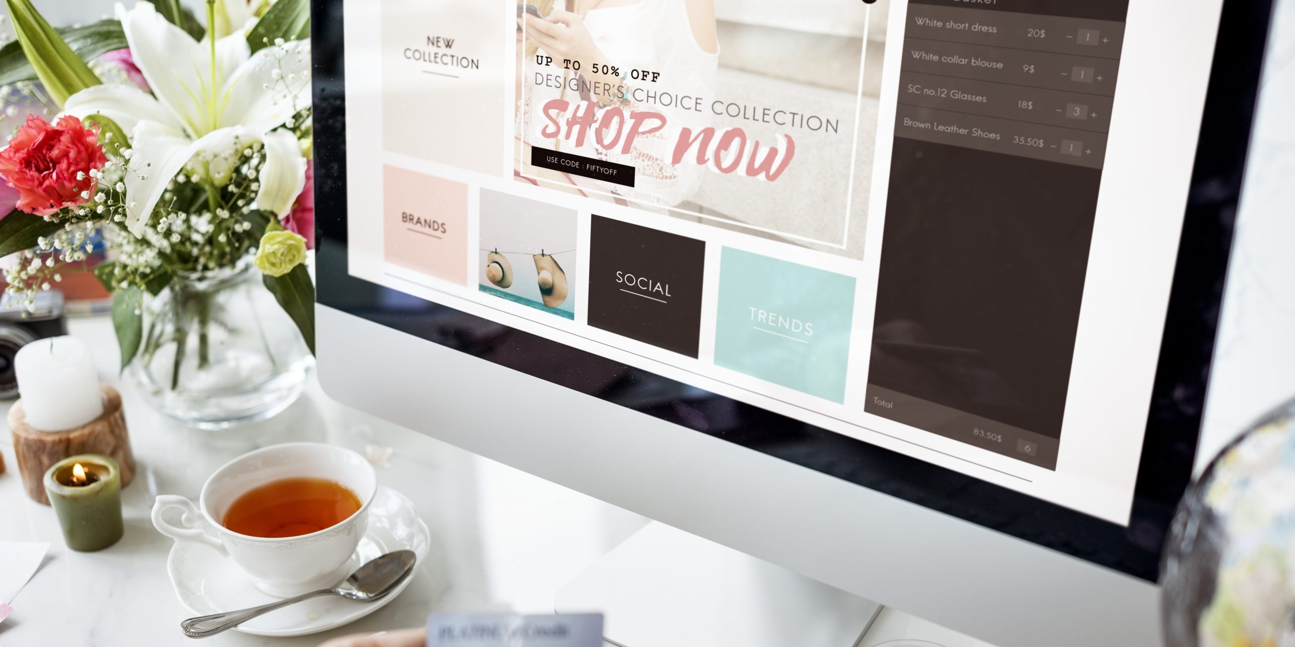
What Makes a Website Convert in 2025
Conversion today isn’t about flashing banners or aggressive CTAs. It’s about user trust, clarity, and intuitive experience. Visitors decide within seconds whether they’re in the right place—and whether they believe your offer is for them.
If your homepage doesn’t immediately communicate who you help, how you help them, and what they should do next, you’re already leaking revenue.
Here’s what high-converting sites consistently get right.
Clear, Outcome-Driven Messaging
Your headline should answer the question: Why should I care, and what’s in it for me? This is not the place for abstract taglines or clever phrases. Save the poetry for your manifesto.
Great homepage headers look like:
- “Clean skincare made for sensitive skin—no fluff, no fragrance”
- “Better sleep in 14 days, backed by real data”
- “From concept to launch: Launch your brand in 90 days or less”
Immediately establish relevance. Be direct. Lead with results, not features.
One Core CTA, Repeated Often
Don’t make visitors hunt for where to click. Pick one primary call to action (buy, book, subscribe, apply) and repeat it up and down the page. Use contrasting buttons. Test different CTA copy (“Get Started” vs. “Try Risk-Free”) but stay consistent with the action itself. You’re not being pushy—you’re guiding.
Social Proof That Feels Real
Skip the generic “What people are saying” carousel. Use real testimonials, real faces, and quantifiable results. Even better, embed short UGC videos, customer quotes from support tickets, or screenshots of real DMs. Authenticity converts better than polish.
If you’ve been featured anywhere legit, add logos—but don’t let them overpower the rest of your content.
Mobile-First, Not Mobile-Friendly
Over 70% of your visitors are seeing your site on their phone. If your mobile experience is slow, clunky, or cuts off key messaging, you’re throwing away traffic. Buttons should be thumb-friendly. Text should be scannable. The add-to-cart experience should be frictionless. Test on multiple devices—not just your laptop.
Where Most Sites Lose Conversions (And How to Fix It)
The most common mistakes we see across ecommerce and brand sites aren’t technical—they’re strategic.
The Homepage Doesn’t Answer “Why Now?”
If your product or offer feels optional, people will treat it that way. Use urgency, seasonal context, or time-sensitive benefits to create immediacy.
Examples:
- “Fall inventory shipping now—limited stock”
- “Spots for January brand launches are already 80% booked”
- “Order by Tuesday to receive it before Sunday”
Deadlines move people.
There’s No Clear Visual Hierarchy
If everything on your page is loud, nothing gets heard. Use spacing, font weights, and layout to guide the eye from headline to CTA. Strip out anything that’s not helping the scroll.
Look at your homepage as a story: does it hook attention, create belief, show proof, and offer a clear next step?
The Site Focuses Too Much on You
“We’re a small team of passionate makers…”
“We believe in quality and sustainability…”
Cool. But how does that help the customer?
Make the visitor the main character. Rewrite your copy from their point of view. Every section should answer: What does this mean for me?
Audit Your Site in Under 10 Minutes
If you’re unsure whether your website is working, run this quick test.
- Open your homepage. Show it to someone unfamiliar with your brand for 10 seconds.
- Ask them: What do we sell? Who is it for? Why buy now?
- Scroll the page yourself. Does every section earn its place—or is it just filling space?
- Click through the purchase flow. Is it smooth, fast, and obvious what happens next?
- Pull up your site on mobile and test every button and form.
The goal is not just usability—it’s momentum. Every click should build confidence, not confusion.
A Website That Converts is a Business That Grows
You don’t need a fancier homepage. You need a site that speaks clearly, guides confidently, and sells effectively. When your website is aligned with how your customer thinks and what they care about, everything gets easier: ad performance, retention, referrals, and revenue.
Design is important. But clarity wins.