Photography That Converts: How to Make Your Product Look Like It’s Already Selling Out
Photography That Converts: How to Make Your Product Look Like It’s Already Selling Out
You’ve probably heard that “content is king,” but here’s a hot take: product photography is your silent salesperson.
Before your product is touched, used, or added to cart, it’s seen. And in ecommerce, a single photo can be the difference between a scroll-past and a sale. It’s not just about looking good—it’s about feeling shoppable.
We’re way past the era of plain white backgrounds and pixel-perfect flat lays. In 2025, the best product photos do three things:
- Stop the scroll
- Communicate value instantly
- Make people imagine owning it
Here’s how to build photo assets that actually move product—not just sit on your homepage.
Start with “the moment” in mind
Most brands shoot products in isolation. It’s clean, safe, and easy. But the photos that convert show your product in real moments—in use, in context, in someone’s hands.
Ask yourself:
- When is my product used?
- What emotion does it create?
- What does that moment look like?
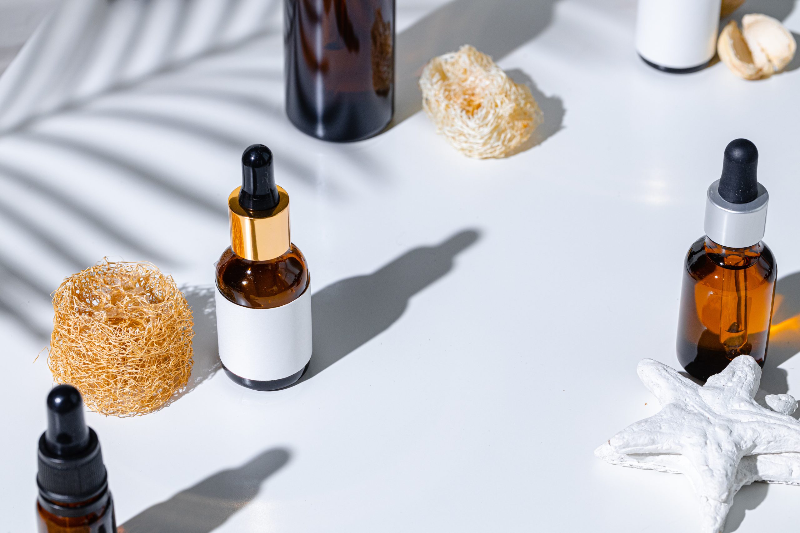
If you sell protein bars, don’t just shoot the bar—shoot someone eating it in the car between meetings. If you sell skincare, don’t just photograph the bottle—show someone applying it in soft bathroom light.
The goal is to trigger imagination. “That could be me.”
Mix formats: every shot has a job
You don’t need 100 images—you need the right mix that tells a full visual story.
Here’s your base shot list:
- Hero shot: Your best-selling product styled clean, bold, centered
- In-use lifestyle shot: Realistic scenario with hands, expressions, props
- Ingredient/details shot: Close-ups of textures, features, labels
- Group shot: Show the product line or bundles together
- Scale shot: Help people understand size (e.g. in hand, next to a known item)
- Movement shot: Pouring, spraying, opening—brings energy to stillness
- UGC feel shot: Slightly raw, natural lighting, handheld style
Each type hits a different conversion point: attention, trust, or clarity.
You don’t need a full shoot—just a plan
Tight budget? No problem. You can get conversion-worthy images with:
- A phone + window light
- Basic foam board or textured paper for backdrop
- 1–2 props that feel brand-right
- A friend or team member as a hand model
What matters more than gear is intent. Shoot with these questions in mind:
- What do I want the customer to feel when they see this?
- Is it clear what the product does and who it’s for?
- Could this stop someone mid-scroll?
Don’t wait for the perfect setup. Build a repeatable one.
Optimize your shots for every use case
Photos aren’t just for the PDP (product detail page). You need assets that:
- Work for paid ads (tight crops, punchy visuals, scroll-stopping)
- Show up well on mobile (clear, bright, uncluttered)
- Fit your brand vibe across touchpoints (email, SMS, packaging, etc.)
- Play nicely with UGC and short-form video (same lighting/look = cohesion)
Before you shoot, decide where each image will live. That prevents waste and builds consistency.
Your images are your brand
People might not read your product description. They might skip your reviews. But they will see your photos—and decide, in under 3 seconds, whether you’re premium, cheap, reliable, cool, or forgettable.
Visual language speaks before words do.
The brands that look like they’re winning? Most of the time, it’s because their visuals told that story first. And the customer believed it.
Great photography doesn’t need a studio—it needs a story.
Know what your product represents. Know what your audience cares about. Then shoot images that show that without saying a word.
That’s how you make people stop scrolling—and start clicking.

The 7-Second Test: Is Your Packaging Working or Losing Sales?
The 7-Second Test: Is Your Packaging Working or Losing Sales?
When someone picks up your product—or doesn’t—you’ve already won or lost. Before ingredients, before pricing, before benefits, your packaging is making the first sale. And you only get about 7 seconds to do it.
That’s not just anecdotal—it’s based on actual consumer studies. Shoppers scanning retail shelves or scrolling ecommerce listings are not reading fine print. They’re reacting to design, color, contrast, and clarity. They’re making snap decisions rooted in instinct and trust.
So here’s the question: is your packaging doing its job?
Let’s break down the 7-second test, how to pass it, and how to design packaging that not only pops—but sells.
What the 7-Second Test Actually Measures
The 7-second test is simple: a customer glances at your product for 7 seconds or less. In that time, they should be able to understand:
- What the product is
- Who it’s for
- What benefit it provides
- Why it feels trustworthy
- Why it’s different from the rest
If any of those aren’t immediately clear, they move on.
This test applies whether your product lives on a crowded Whole Foods shelf, in a TikTok unboxing, or on an Amazon listing full of competitors. Packaging is no longer just physical—it’s visual marketing across all channels.
Where Most Packaging Fails
Packaging fails when brands try to be clever instead of clear. It fails when there’s too much text, too little contrast, or too much emphasis on aesthetics over function.
Here’s where we see the most issues inside CPG and DTC brands:
Design for Shelf vs. Screen
What works on a box at Erewhon doesn’t always work as a thumbnail on Amazon. Your packaging needs to be optimized for distance, mobile screens, and scroll speed. If you’re not testing your packaging in digital formats, you’re missing half the equation.
Overloaded Front Panels
Less is more. You don’t need to explain everything on the front. You need to say one thing very clearly. Use the back or side panels for details. Use icons, not paragraphs. Use whitespace like it’s expensive real estate—because it is.
Inconsistent Visual Language
Your font, colors, imagery, and tone need to align across the packaging. Confusion kills trust. If your front says "clean wellness" and your back panel feels like a pharmaceutical label, customers won’t know how to read you—and they’ll default to a brand that’s easier to understand.
What High-Performing Packaging Has in Common
Strong packaging tells a story fast. It’s not just about looking good—it’s about making the shopper feel like this was made for them.
Clear Value Proposition
What is the one core outcome this product delivers? Make that the hero on the front. If you’re selling energy, focus the copy and design around that. If it’s calming, the packaging should reflect that visually and emotionally.
Strong Visual Hierarchy
The eye should go exactly where you want it to. Use typography, contrast, color blocking, and layout to control attention. The most important message (product name or benefit) should be the most visually dominant.
Shelf Disruption
Your category probably looks the same—pastel, wellness minimalism, or bold primary colors. One way to stand out is to intentionally contrast with what’s around you. If the shelf is soft and organic, maybe you go graphic and bold. Standing out gets you picked up. Being clear gets you bought.
Social First Thinking
Will someone post a story about your packaging? Will they stop scrolling on TikTok if they see it? Will it look great in someone’s hand during a GRWM video? Packaging today needs to double as a content engine—because your audience is your distributor.
How to Run a 7-Second Test on Your Own Packaging
Gather a few people who don’t know your brand. Show them your packaging (in person or as a digital mockup) for just 7 seconds. Then ask them:
- What is this?
- Who do you think it’s for?
- What benefit does it give?
- Would you trust this product?
- Would you pick it over others on a shelf?
Their answers will show you exactly where your packaging succeeds—and where it needs to be reworked.
Also test it:
- On your phone (screenshot next to competitors)
- In grayscale (does the contrast still hold?)
- Against a white background (for Amazon)
- On Instagram Stories (does it catch your eye?)
These aren’t hypothetical exercises. They’re filters for real-world performance.
Packaging Is Brand Storytelling in Seconds
At Youngry, we treat packaging as more than a label—it’s the first conversation your brand has with a customer. If your packaging doesn’t communicate fast, build trust visually, and feel emotionally aligned with your audience, it’s not just a design issue—it’s a growth issue.
Because the truth is, people don’t buy products. They buy signals. And your packaging is the loudest signal you send in a sea of competitors.